All that Glitters is Bold
Hi, my name is Anna Wiggins. I am Katie Simpson’s Executive Assistant. Today, I had the chance to sit down with her and learn about one of her latest design projects.
First, let’s get a little background on this project:
This new construction situated on the lake in Vonore, TN is what Katie refers to as her “masterpiece.” She worked hand in hand with her clients from the very start to the final selection made. She loved that these clients valued her opinions and expertise, allowing her to guide them through everything from layout, design, cabinetry, and material selections all the way down to the baseboard styles. While this was the couple’s second new build project, this time they were building their forever home after their last of 3 children had moved out. They wanted to create a space that would align with their personal aesthetics and allow for entertaining while also encouraging their grown children and future grandchildren back to visit. Selections were thoughtfully chosen with clean lines and durability for the future.
This project took 13 months from start to finish and includes a large open concept kitchen/dining/living area, 2 primary suites, a guest bedroom, and a fully finished basement complete with a kitchenette and outdoor kitchen.
Now, for some highlights:
When asked about her favorite feature of this home, Katie said
“I know this sounds cliche, but wow, it is so hard to pick just one because we chose some beautiful statement pieces for each area.”
Katie is adamant about each client picking a splurge item (or several) that is going to make their heart flutter. She always works with her clients to offset these costs with other home selections that are “save” items, and helps to pull off higher ticketed items. Some favorite splurge features she described in this home (by room) were:
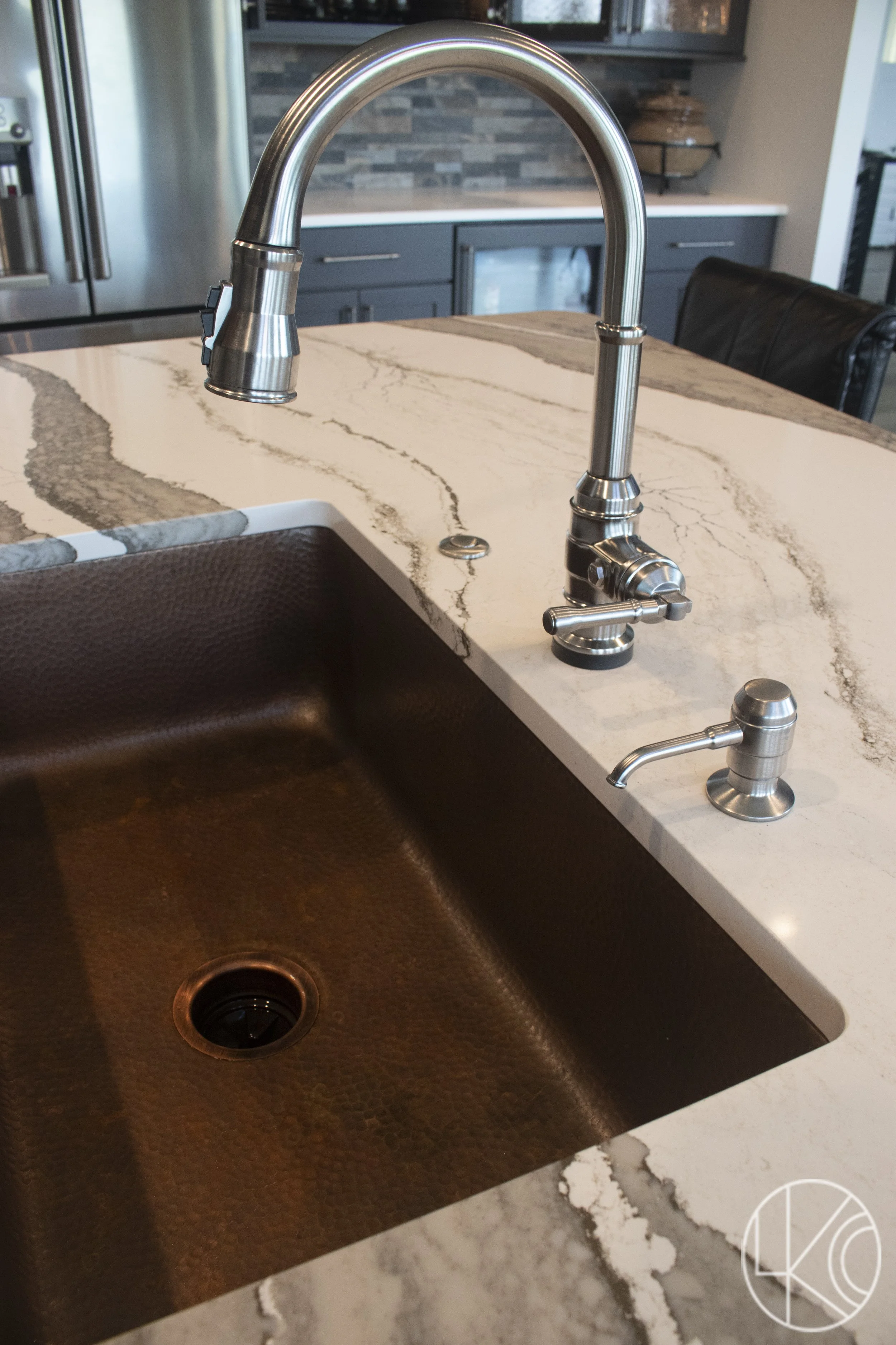
Kitchen: the custom copper hood. Katie worked with a local ironsmith from start to finish. She drew up the shape, selected the exact copper patina and texture that was used (astonished at just how many options exist), and worked with the ironsmith to hone in on the perfect banding, rivets, etc. to create this masterpiece. This custom hood was the starting point for the kitchen with the rest of the elements designed around it. The charcoal stained quarter sawn oak cabinets were selected to add boldness without a stark contrast. We also used some beautiful, heavily veined island countertops with a copper undermount sink to match the hood. We chose Cambria Skara Brae and worked with Smokey Mountain Tops to fabricate the countertops.
Primary Suite 1: the black bathtub Katie had been dreaming of installing in a home for years. As with the kitchen, Katie likes to start with a statement piece and build around that, so the other bathroom elements were designed around this feature. She went with a really fun black and white geometric patterned tile for the floor and complemented that with softer selections for the rest of the area. She introduced color in the vanity by using Sherwin Williams Sea Salt and topped that with a black soapstone looking quartz.
Guest Bath: an antique dresser with attached mirror. Converting this piece to a vanity was a labor of love, for sure. It was purchased from an antique store in Clinton and professionally painted and topped with a soapstone looking quartz. The sink was carved out of the same top for a seamless look. Katie loves how unique this feature is, but suggests that if anyone goes this route to put the cabinet in an area that is not used as often (as a primary bath/kitchen cabinet), because you won’t have soft close features and the antique may not be as durable/resistant to wear and tear. In this instance, the guest bath was perfect for this. Katie and the homeowners were all thrilled with the color combination of the green paint, soapstone top, and brass finishes.
Basement Kitchenette: a pass through window that opens out into the outdoor kitchen area. Katie had the pleasure of attending a post-construction cookout and enjoyed standing in the kitchen while having a conversation with someone who was sitting outside. She loved being able to pass some snacks through the window to share with the outdoor guests!
Hindsight is 20/20:
When asked if there was anything Katie or the homeowner would have changed on this project, she said they would have splurged on gas exterior features. They wanted to go with copper exterior light fixtures that had gas run to them for a real flame. They instead selected a less expensive option with bulbs intended to mimic the look of a gas flame. They simply did not perform. Some splurges are worth it. This is an area where Katie can take what she has learned over years of design work and guide her clients on items worth splurging and saving.
Final takeaways:
Katie points out that you CAN marry different styles. You can start with a primary theme and explore other styles mixed in, as long as you’re doing it well. For instance, you likely wouldn’t want to pair a highly traditional space with Japandi, but combining rustic, industrial, and modern high end elements in this home worked cohesively. They didn’t fully commit to the industrial or modern farmhouse styles but incorporated elements from each, which is why she has termed this particular project Luxury Industrial Modern Farmhouse. Finally, a heads up that if this home ever hits the market (though doubtful), Katie will be first in line to make an offer on this dream home of hers!


